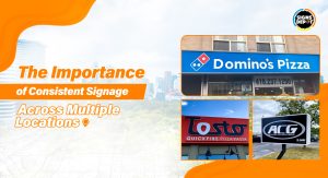

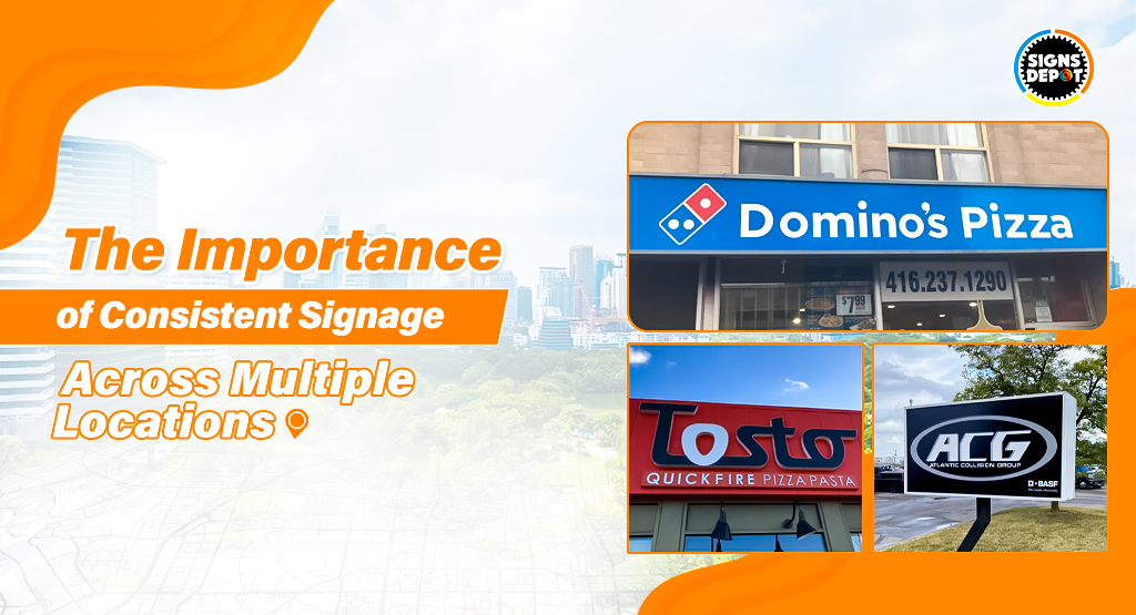
If your business has multiple locations, your signage solutions shouldn’t look like a thrift store wardrobe. You know—random, chaotic, and stuck in 2003. Inconsistent signage isn’t just a design fail. It’s like sending mixed signals to customers: “Hey, we’re kinda the same company… but also maybe not? IDK, figure it out!”
We have spent years fixing signage disasters for everyone from mom-and-pop shops to franchises. Most brands treat signage like a secret weapon, not an afterthought.
Let’s break down why consistency matters and how to pull it off without losing your mind (or your budget).
1. Brand Recognition: Stop Confusing People
Your brand is like your business’s fingerprint. It’s what makes you stand out in Mississauga’s competitive market. But if your signage looks different at every location, customers might as well be playing “Guess Who?” with your brand.
- Example: Imagine if Taco Bell suddenly swapped its purple-and-pink neon for a classy gold-serif font. Or if Chick-fil-A’s cows stopped misspelling “EAT MOR CHIKIN” and started quoting Shakespeare. Chaos!
Consistency isn’t boring—it’s how customers remember you. When fonts, colors, and logos match everywhere, your brand becomes recognizable.
Here are quick tips to bring quirkiness to your brand:
- Create a “Signage Bible” (yes, it’s a thing). Include HEX color codes, approved fonts, logo sizes, and rules for spacing. No winging it.
- Use the same materials everywhere. If Location A’s sign is matte metal, Location B’s shouldn’t be glitter vinyl.
Recommended reading: The Importance of Signage in Creating a Strong First Impression
2. Customer Experience: Don’t Make Them Work for It
Ever walk into a store and think, “Wait…is this the same place?” Maybe the outside sign says “Urban Brew Coffee” in sleek black-and-white, but inside, the menu looks like a MySpace page—neon green Comic Sans, clipart espresso cups, and a logo that’s 80% smaller.
If your customer is confused, it means you have lost sales.
Consistency builds trust. If your signage is polished and predictable, people assume your products are too. But if your signs look like a middle-school PowerPoint project? They’ll assume your lattes taste like regret.
3. Operational Efficiency: Save Money (and Your Soul)
Inconsistent signage is like flushing cash down the toilet. Custom signs for every location? Rebranding every time a manager gets “creative”? No thanks.
Here’s the math:
- Bulk Orders = Big Savings: Standardized designs let you order materials in bulk. Think 30% cheaper per sign.
- Faster Rollouts: New location? Use the same signage blueprint. No redesign fees, no headaches.
- Easy Repairs: Broken sign? Replace it fast with pre-approved materials instead of hunting down a custom designer.
4. Trust: Look Like You’ve Got Your Act Together
People judge your business in seconds, and your signage is their first impression. Sloppy, mismatched signs scream, “We don’t care!” But consistency? It whispers, “We’ve got this.”
Example:
- Apple Stores: Identical worldwide. Clean glass, minimalist logos, no clutter. You know exactly what to expect.
- McDonald’s: Golden arches look the same whether you are in Miami or Mumbai. They tweak menus for local tastes but keep the core branding locked down.
This means trust isn’t built overnight. It’s built by nailing the details—repeatedly.
5. Common Mistakes (AKA How to Piss Off Your Customers)
Even big brands screw up. Don’t be like them:
- The “Creative Freedom” Fiasco: Letting managers DIY their signage. Your brand isn’t a community art project.
- Ignoring Local Vibes: Consistency must not be a synonym for rigidity. Adjust for language or culture without ditching your brand’s soul (e.g., Starbucks adds regional menu items but keeps its green mermaid iconic).
- Digital Amnesia: Your physical signs are perfect, but your Google profile uses a low-res logo from 2010. Update. Every. Platform.
6. How to Actually Pull This Off (Without Losing Friends)
Step 1: Build a Style Guide (Yes, Really)
This isn’t corporate jargon—it’s your signage survival kit. And this style guide includes:
- Logo Rules: Size, placement, what not to do (e.g., no stretching, no rainbow filters).
- Color Codes: HEX, RGB, Pantone—specify them all. No, don’t just mention “shades of blues.”
- Fonts: Approved fonts (and backups if your first choice isn’t available).
- Tone: Should all signage solutions sound fun, professional, or edgy? It depends on your brand and product. But keep in mind that the voice must be consistent.
Step 2: Hire Signage Pros and not your next-door neighbors:
Companies that specialize in multi-location signage know how to handle:
- Scaling: Making designs work for tiny storefronts and billboards.
- Materials: What lasts in the Arizona sun vs. the Minnesota snow?
- Permits: Because nobody wants a fine for an illegal sign.
The best sign shops in Mississauga know all these. Hire them and be carefree; they are aware of completing the project in a refined manner.
Recommended reading: The Importance of Compliance: Legal Regulations for Outdoor Signage
Step 3: Audit Like a Detective
Signs fade. Neighborhoods change. Audit every location annually. Ask:
- Are colors fading?
- Is the logo still aligned?
- Did someone slap a “SALE!” sticker over half the sign?
Step 4: Train Your Team (No Exceptions)
Explain why consistency matters. Show them the style guide. Threaten to revoke coffee privileges if they DIY a sign. (Kidding… mostly.)
7. The Hidden Perk: Marketing That Works While You Sleep
Consistent signage isn’t just for customers—it’s free advertising. Think about it:
- A unified look makes your brand instantly recognizable in photos, social media posts, or even drone shots.
- Ever seen a Target sign? You know it’s Target before you read the word. That’s the power of consistency.
- Just a suggestion: Use signage in your social media strategy. Post pics of your iconic signs at different locations. Customers love tagging the best exterior Signs in Mississauga. This means they like uniform, photogenic spots.
8. Examples from the real world that can help you:
- Dunkin’ Donuts → Dunkin’: They dropped “Donuts” from their name but kept the pink-and-orange colors and font. Consistency made the rebrand seamless.
- Walmart’s Spark Logo: The yellow spark is identical everywhere, making their stores easy to spot from highways.
- Local Gym Chain MVP: A client added subtle location-specific murals (e.g., city skylines) behind their standard signs. Remember, the best exterior signs in Mississauga are the ones where brand consistency meets the local flavors.
Lastly, we can conclude that consistent signage isn’t about stifling creativity; it is about being reliably awesome. It builds trust, saves cash, and turns your locations into a brand army. So, stop letting your signs look like a garage sale. Lock down your rules, stay vigilant, and watch customers choose you over the competition. But it is only possible if you choose the best sign shop in Mississauga.
Tired of signs that whisper when they should scream? Your brand deserves better than a yawn-inducing storefront. At Sign Depot, we craft signs so sharp, bold, and unapologetic that even your competition will stare. From neon that pops to banners that stop traffic—let’s make your business impossible to ignore.