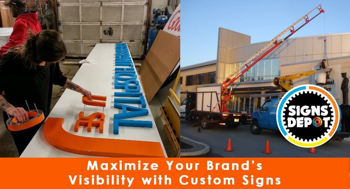
Custom signage is a broad and versatile concept, encompassing a wide range of distinct visual displays customized to specific needs. Unlike pre-made signs readily available for purchase, custom signs are specially crafted with careful consideration. In essence, this term refers to creating unique visual communication solutions for businesses or organizations, aiming to enhance visibility, convey messages, and make a memorable impression on their target audience.
Benefits of custom sign
Businesses use custom signage to create memorable first impressions and distinguish themselves from competitors. These custom signs leverage distinctive color schemes, graphic designs, and messaging to encapsulate the essence of the business and boost brand recognition. When strategically placed in high-traffic areas and well-illuminated, custom signage offers round-the-clock advertising, ensuring visibility at any time of the day. The term ‘custom’ indicates that these signs can be tailored to any size, design, layout, and color combination, providing limitless possibilities.
10 ways to create attractive custom signs:
Custom signs come in various forms to suit different purposes. Whether you need an exterior storefront sign, an eye-catching billboard, an illuminated channel letter sign, or interior signage to guide customers within your establishment, the possibilities are endless. Custom signs can be designed to fit your specific location, goals, and audience.
Now that we know the various benefits of custom signs let us take a look at how we can enhance custom signs to maximise your brand visibility
Top 10 Innovative Ideas for enhancing Storefront signs
Understanding Your Audience:
To build an appealing bespoke sign, you must know your target audience well. This requires studying their demographics, preferences, and expectations. Your sign should match their requirements and wants. Your sign’s style and messaging should match your target audience’s tastes, whether they’re young and trendy or older and more traditional. Consider age, gender, income, and location when analysing your target. Market research and data are essential for sign design because what appeals to one group may not to another.
You should also evaluate your audience’s psychographics—lifestyles, values, and interests. Do they care about nature? Value luxury and exclusivity? Your message can connect deeper by aligning your sign with your target audience’s psychographics.
Signage Location Selection:
A successful bespoke sign depends on its location. Where your sign goes should strongly influence its design. Consider visibility, surroundings, and reading distance. Consider your sign’s audience while picking a site. Will pedestrians or drivers notice it? How will illumination fluctuate during the day? These factors will help you choose the right sign size, style, and orientation to meet its needs.
A sign in a busy urban area may need to be more eye-catching to compete with distractions, while a sign in a quieter suburban neighbourhood may benefit from a more modest design that matches the landscape.
Choosing High-Quality Materials for Durability and Aesthetics:
Your custom sign’s materials should be durable and attractive. Buying high-quality materials can improve the sign’s appearance and durability. Choose materials that look beautiful and can survive the elements and wear and tear, whether metal, wood, acrylic, vinyl, or another. Outdoor signs need weather- and UV-resistant materials to last. Remember, the material choice might also convey brand values. A rustic wooden sign may represent tradition and authenticity, while a sleek, modern metal sign may convey innovation and sophistication.
Check the legibility of the font:
Legibility is essential for effective communication on a personalised sign. If it’s hard to read, even the most beautiful sign is useless. This requires careful font, typeface, and typography selection. Choose distance-readable typefaces. For readability, font size, colour, and background contrast must be optimised. High contrast between text and background highlights text in various lighting conditions. Also, consider letter spacing and line height (leading) to avoid overcrowding and increase sign legibility. These typographic subtleties are often missed but can make a big difference.
Leveraging Colour Psychology for Emotional Impact:
Sign design uses colours to create many emotions and associations. The colours you choose affect your sign’s beauty. Consider colour psychology when choosing a colour scheme to match your brand’s message and feelings. For example: Red symbolises passion, whereas blue conveys trust and reliability.
Colour selection should consider cultural and geographical connotations. Understanding cultural context is crucial if your target audience is diverse since colours have different meanings worldwide. Thus, to take into account the context of your sign. A colour that stands out in one setting may be ignored in another. Your colours’ contrast with the background is also important for visibility.
Simplifying and Clarifying Design:
In sign design, “less is more” is true. A complicated sign might confuse viewers and dilute your message. Design a simple, clear personalised sign to make it appealing. Effective communication requires simple language and uncluttered images. Your sign will look better and be easier to read with a simple design. A clutter-free sign helps consumers understand your message quickly, grabbing their attention. Use negative space to highlight your sign’s main message or images. Negative space balances the composition and draws attention to the main parts.
Include Professional Graphics and Imagery:
Make sure your bespoke sign has high-quality, professionally made graphics and photos. Pixelated graphics can make your sign look amateurish and unprofessional. Professional graphics appear better and help your sign’s design flow. Well-designed graphics and high-resolution photos can improve your message. Visuals should match your brand identity and messaging for your business or organisation. Graphics should complement text and colour and blend into the design.
Ensure consistency:
Custom signs should reflect your brand. Your brand’s logos, colours, and branding must be consistent. Consistency boosts brand familiarity and makes your sign more desirable to customers. Make sure your custom sign’s parts and colours match your brand. This integrated approach reinforces your brand’s message and values, making your sign readily recognisable to customers and prospects. Consistency builds confidence and reliability. Well-branded signs reassure customers that they are dealing with a trustworthy company.
Use of LED signs: LED signboards:
attract daylight and evening passersby with their bright glow, boosting your business’s exposure. These flexible signboards may successfully communicate your business message and promote events or special deals with customers. It may enlighten visitors about your business and capture them with a beautiful visual depiction of your brand. Since no two brands are alike, your signboards should reflect your brand’s essence, values, and personality. LED signage brings your brand vision to life with precision and delicacy, making your firm stand out.
Regular Sign Maintenance:
A neglected sign loses its appeal. Regular maintenance keeps your sign looking good and having the desired effect. Maintenance may involve cleaning, painting, and fixing. Outdoor signage fades due to weather and environmental variables. Regular inspections and touch-ups will keep your sign looking good. To stay relevant to design trends and marketing messages, update your sign periodically. Keep your sign current to avoid sending the wrong message about your business.
Custom signs are not your run-of-the-mill, one-size-fits-all signs you might see on the street. They can be created in various shapes, sizes, and styles, allowing businesses to express individuality and distinctiveness. You can contact Signs Depot, a custom sign company in Toronto, for a well-crafted custom sign that can attract passersby round-the-clock and entice them to explore your business.


