Have you ever stood bewildered in front of a cluster of unmarked doors, uncertain which would take you to your destination? Well, many people face this type of situation in their lives. Traversing the inside of buildings, whether shopping centres, office premises, or healthcare facilities, can often feel like starting a mystifying journey without a map.
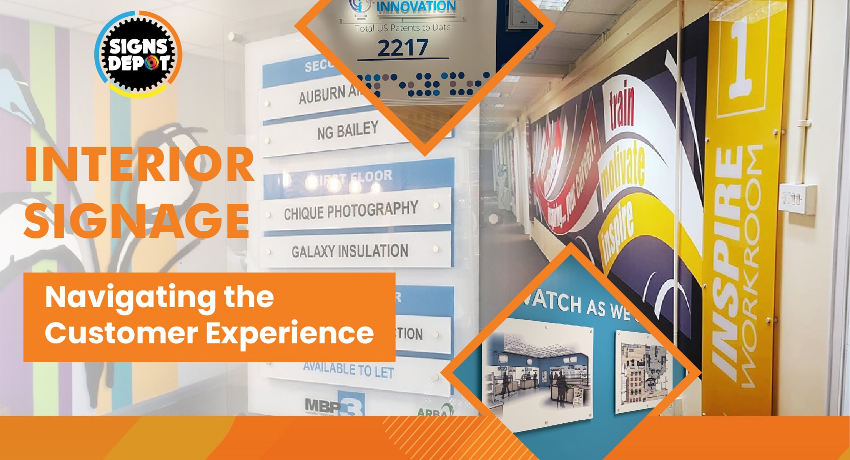
Effective navigation within interior areas is essential in today’s tech-driven era, where every second matters. Here, interior signage serves as a humble guide, improving the user experience and confirming easy movement within the premises.
However, achieving effective interior sign solutions for your buildings/offices is a daunting task. You need to meticulously maintain the perfect balance between design, benefits, and understanding of consumer behavior. In this context, you should consult the best signage company in Toronto that will provide you with unmatched sign solutions for seamless navigation inside your utility in Toronto.
But, at the same time, you also need to know about the boundless power of interior signage and how you can utilize these signs to make your office space happening and easily communicable for employees or visitors.
Well, this blog explains the importance of interior signs for improving customer experience and explores real-life challenges that companies often face while designing optimal navigation experiences for their consumers.
The importance of interior signs for businesses
Interior signs are imperative in uplifting customer experience by offering strong and crisp information, direction, and marketing messages. Whether guiding customers to their final stations, promoting new products/services, or emphasizing brand identity, meticulously designed sign solutions offer positive impressions and raise customer satisfaction.
Let’s consider some prime benefits of interior signage solutions
Wayfinding Efficiency:
Wayfinding signs are important as they help pedestrians navigate unaccustomed places with simplicity and confidence.
Suppose you design seamless signs with straightforward typography, innate symbols, and unswerving design elements and place them in strategic locations. In that case, they will undoubtedly offer reliable guidance to customers, lessening misunderstanding and frustration among people.
By simplifying the navigation procedure, indoor signs boost the overall customer experience, creating an enduring impression, efficacy and professionalism among them.
Branding and Identity:
Interior signs act as a robust advertising tool for strengthening brand identity and creating a consistent visual background.
By including your brand colors, logos, and messaging in the designs, companies can create a firm presence within their places, nurturing brand recognition and trustworthiness. Unswerving branding across all advertising mediums strengthens the company’s appearance and imbibes trust in users, improving the overall brand image.
Information Accessibility:
Apart from offering wayfinding, interior signs are important in providing necessary information to customers. From directory boards and chamber labels to safety guidelines and event announcements, signage offers an appropriate communication channel, keeping everyone up-to-date and engaged.
Universal sign symbols ensure that information is effortlessly understood by a varied range of customers, including people with disabilities or language hurdles.
Enhanced Customer Engagement:
Vibrant and interactive signs offer endless opportunities for companies to engage consumers in significant ways. Digital displays, touchscreens, and interactive kiosks not only provide essential information, entertainment, and better communication experiences but also amplify customers’ journeys.
Technology has penetrated every field these days; the same goes for signs. Companies can create unforgettable interactions that leave an affirmative impression on consumers and fortify brand loyalty.
To know more about interior signage, follow our blog:
Interior Signage: Blending Aesthetics and Functionality
How to create effective interior signs
While designing interior signs for your business, you should be very careful in terms of certain factors like visibility, readability, elegance, and functionality.
Follow the below-mentioned strategies to create robust signage solutions.
Prioritize Clarity and Simplicity:
While choosing the design, keep your messages clear, crisp, and easy to apprehend by anyone. Don’t include excessive or unnecessary information. Just provide the required information to curtail cognitive overload and ensure quick understanding.
Optimize Visibility and Legibility:
Always select the right fonts, colors, and contrast levels to optimize legibility and visibility. Choose font styles that are visible from far away and use contrasting color combinations to improve readability, especially in low-light streets.
Consider Location and Placement:
Location is a game-changer when you plan for outdoor signs in Toronto. Strategically place these outdoor signs in the most-visited areas of Toronto.
Pay attention to certain parameters like eye-level placement, directional prompts, and line of sight to certify that signs effectively guide passersby to their endpoints.
Embrace Technology:
To sustain in this competitive world, you need to employ new signage solutions like digital signs for the betterment of your business. Digital signs not only improve flexibility and interactivity but also offer real-time updates.
Digital displays, touchscreen kiosks, and mobile applications are ideal communication platforms that companies can customize and offer tailor-made content according to their businesses.
Know more details about interior signage from our blog:
Creating a Strong First Impression with Exterior Signage
Challenges in Interior Signage:
Cluttered Environments
Imagine yourself standing in a buzzing airport terminal or a packed shopping centre. Decrypting signs becomes challenging among the commotion of folks and plenty of distractions. Chaotic atmospheres annoy individuals, making it hard for them to proficiently discover the information they need.
In these cluttered situations, signage with clear typography, distinct colors, and tactical placement not only grabs customers’ attention but also guides them effectively.
Intricate Architectural Layouts:
Skyscrapers often develop convoluted architectural designs with numerous levels, passages, and rooms.
Navigating these tortuous edifices can leave visitors feeling bewildered and irritated. Moreover, buildings with many occupants or departments may add another layer of intricacy, requiring signs catering to varied needs without devastating users.
Customized sign solutions that are designed for specific user groups are ideal for such navigation. They will increase visibility and steering experiences in such environments.
Versatile Environments
Retail shops often reorganize merchandise displays, offices undergo restorations, and healthcare centres refurbish their departments’ locations.
In dynamic situations where layouts change with time, static signs become obsolete and inapt. Thus, businesses should look for digital solutions furnished with real-time updates and collaborative features. Digital signs allow businesses to adopt changes quickly and provide essential information to guests.
Accessibility Considerations:
Accessibility is one of the premium facets of user experience. But many companies overlook this point while designing signs. People with disabilities, such as visual injuries or mobility restrictions, face problems when traversing areas lacking all-encompassing signage.
While designing signage, businesses should include features like Braille text, perceptible elements, and universal symbols to ensure that signage solutions fit all needs.
Brand Consistency:
Though signage offers extensive functionality, it also signifies an extension of a brand’s uniqueness. Maintaining uniformity in branding components across signage systems improves brand recognition and nurtures a consistent visual identity.
However, achieving consistency across various environments, like franchised outlets or multi-site organizations, appears challenging. Employing homogeneous design templates and guidelines assists brand cohesion while allowing flexibility to acclimatize to varying spatial restraints and requirements.
Information Overload:
To provide everything under one screen, sometimes, companies design signage with overloaded information, burdening consumers with unnecessary details that lead to intellectual overload.
To make navigation process facile, businesses should include essential information while creating signs. This not only enhances users’ focus on their offerings but also allows them to recollect the message easily.
Examples from Real Life:
Hospital Navigation
Hospitals are infamous for their intricate layouts, with several wings, divisions, and floors. Patients/visitors often face difficulties in navigating these extensive facilities.
Effective indoor signs, such as color-coded corridors, native symbols for departments, and digital kiosks with maps, lessen navigation problems and improve the overall healthcare experience.
Retail Environments:
Retail owners vie with each other to make hopping experiences simpler to improve their sales and customer loyalty.
However, substandard signs can inhibit this goal, causing frustration among shoppers. If this happens, businesses will lose revenue opportunities.
Retail ogres like IKEA face this challenge by integrating directional signage like product classification markers and digital displays to promote new products, and so on. All these signage strategies make navigation easier without tampering with customers’ engagement with the offerings.
Office Premises
Offices are trying to provide happening workspaces to employees so that they can stay motivated and focused. Effective signage is imperative in guiding employees and visitors through these complex spaces.
Tech giants like Google and Microsoft implement state-of-the-art signage solutions, such as interactive touchscreens presenting floor plans and real-time room availability, improving productivity and teamwork within their office complexes.
Conclusion
Interior signage can be considered as a quiet navigator guiding and managing individuals through the intricacies of building environments.
By solving real-life challenges such as jumbled environments, intricate layouts, and accessibility considerations, companies can create the best navigation experiences that uplift customer satisfaction and brand loyalty. Through inventive design approaches, technological improvements, and a user-centric method, interior signage continues to thrive, redesigning how we traverse and interact with the places around us.
If you want to create compelling interior signs for your business in Toronto, you should consult with Signs Depot, an established signage company. Our deft designers can create unmatched indoor and outdoor signs like building signs, pylon signs in Toronto, wayfinding, etc.
For any signage requirements, contact us.
FAQs
What materials are commonly used for interior signage?
The materials that are highly used in interior signage are acrylic, metal, wood, vinyl, PVC, and foam board. Depending on ad budget, targeted audience, durability, and location, businesses are free to choose the right materials for their signage projects.
Can interior signage be customized?
Depending on the objectives and usage, companies can customize their interior signs. They can create tailor-made designs, colors, materials, sizes, and messaging that complement their existing brand requirements and messages.


