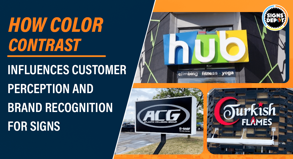
In Mississauga’s cutthroat business landscape, signage solutions are essential marketing tools to get instant attention from customers and improve brand identity. Many organizations are hiring a reputed sign company in Mississauga that will design enthralling and informative signs for their businesses. When we talk about signage design, color contrast plays a crucial role.
When used successfully, color contrast not only improves visibility but also targets the right customers. By improving consumer perception, these color contrasts make your brand more trustworthy and memorable in the market.
Businesses also need to understand how color contrast improves their signage strategy and resonates with their audience. Well, this article clearly establishes how color contrast in signs improves a brand’s visibility and market recognition.
The Basics of Color Contrast
Color contrast implies the variance in luminance or hue that makes elements discernible from one another.
For signage solutions, it is the difference between the background color and the text or graphics used. High-colored contrast makes your signboards stand out and clearly visible in Mississauga’s market, while low contrast makes them visually dull. Your customers need to put stress on their eyes when reading the texts of exterior signs in Mississauga.
When you opt for a signboard that comes up with dark text on a light background (e.g., black on white) or light text on a dark background (e.g., white on blue), customers can easily understand the contrast and comfortably read the message.
But, if there is no differentiation in colors (e.g., dark blue on black), human eyes may not distinguish the difference.
Why Color Contrast Matters for Customer Perception
Visuals are not only appealing but also the human brain processes them faster than normal texts. Color contrast plays a significant role in building first impressions. Let’s take a look at how this contrast inspires consumer perception.
Immediate Attention:
Exterior signs in Mississauga that possess high color contrast may be easily noticed by users, even from a distance. This instant recognition can make a significant difference in crowded areas of the city where companies are vying for pedestrians’ fleeting glances.
Readability and Comprehension:
Useful contrast improves a sign’s readability, ensuring that the message is clearly understood by all without stretching. If consumers can’t read your company’s signboards, they may become annoyed or ignore them. It will certainly put your branding efforts in vain and you can lose potential customers.
Professionalism and Trust:
When you thoughtfully incorporate color contrast in your business signs, it will portray a sense of professionalism and trustworthiness. Customers consider businesses more credible and professional that offer clear, legible signage solutions.
Emotional Impact:
Colors build emotions when infused with proper contrast.
When you choose a yellow background color for acrylic signs in Mississauga and use black-colored texts, you may instill a sense of urgency and energy. These signboards attract oodles of attention and amplify sales volume.
On the other hand, if you run a comfort or luxury brand in Mississauga, by opting for a softer hue with well-contrasted elements, your brand may portray a sense of elegance or relaxation.
Enhancing Brand Recognition through Color Contrast
When you consistently use color and contrast, readability and brand identity become stronger. Let’s see how this improves brand recognition in Mississauga’s competitive market.
Reinforcing Brand Colors:
Though color contrast is pivotal, you need to incorporate the right brand colors to get the maximum benefits.
Companies should try to use the right combinations that align with their brand hues, creating an all-inclusive and decipherable visual identity. If your organization’s theme color is dark blue, you should use this color with a complementary light color while designing acrylic signs in Mississauga. This contrast color separates your signage solutions from competitors and makes them memorable.
Creating Visual Hierarchies:
Signboards are the best way to convey diverse information. By using proper color contrast, you can establish a visual hierarchy, guiding your customers to pay attention to the most important elements first.
You can use bold, high-contrast colors to display your brand’s name. Then, use subdued contrast to support other details to uphold readability without contending for attention.
Recommended reading: How Outdoor Signs Influence the Growth and Success for Local Businesses?
Memorability and Differentiation:
Signage that possesses fruitful color contrast stands out in the market and is quickly remembered by customers.
This is extremely beneficial in Mississauga’s competitive markets where companies are adopting various strategies to differentiate themselves. A memorable and visually appealing sign helps customers to recall your company’s location and services when they need them. As a result, you may experience higher customer engagement and loyalty.
Challenges and Solutions
Now, businesses have adequate knowledge regarding the importance of color contrast, but the execution could be a tricky endeavor. Though they can consult with the sign company in Mississauga, challenges couldn’t be ignored.
Companies may face several challenges, such as balancing brand colors with effective contrast and offering the highest visibility in various lighting conditions. But there are certain solutions to overcome them.
Testing in Different Environments:
Before finalizing, you need to check the visibility of business signs in various lighting conditions, such as natural sunlight, shade, and at night (if illuminated). Once you are done with all the tests, you can only ensure that their effectiveness remains intact across various scenarios.
Using Contrast Tools:
You can check contrast ratios using various online resources and designing tools. This will help you determine whether your signs meet readability standards.
Consulting Professionals:
Try to hire a professional signage expert that will help you to choose the right contrast and color combinations.
Conclusion
Color contrast is an integral part of business signs that influence customer opinion and brand recognition in the market. It not only draws adequate attention but also improves readability and establishes trust. In a nutshell, it contributes significantly to a brand’s identity.
Companies that understand and apply the basics of color contrast may create signage solutions that separate them from competitors and resonate with targeted demographics.
When businesses in Mississauga want to utilize the benefits of signs, they should work with an experienced and reliable signage provider to make a striking difference. Here enters Signs Depot, known for its expertise and proficiency in custom signage solutions.
Our professionals will guide companies in selecting the right colors and contrast to make their signs powerful, impactful, and effective. From door graphics to floor decals and acrylic, we help companies create memorable and compelling signs that uplift their brand in a hyperactive market.
What color contrast will give your signboards the highest visibility and brand identity? Send us your queries to get the right solutions. Visit Signs Depot’s official website to learn how our designed signage solutions are boosting the company’s brand recognition, image, and market reputation.


