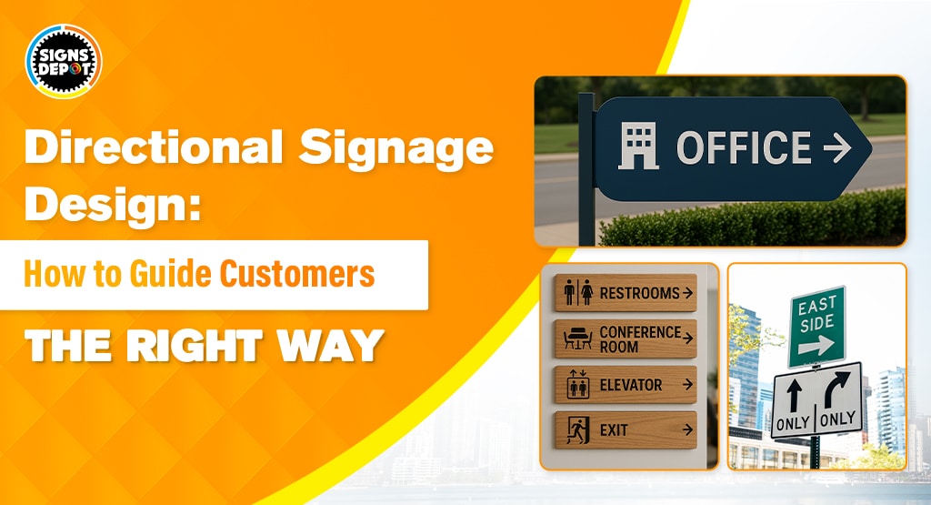
Effective directional signage is a must for any business in Toronto. Sometimes, Google Maps may not give proper information. Between the never-ending construction on Spadina, the chaos of Yonge-Dundas Square, and streets that zigzag like they’re auditioning for a maze championship, these signs can help your business cut through the clutter.
You must not leave your customers muttering, “Where is this place?” before they give up and head to the nearest stores. Thus, here are some tips and tricks to make your signs so clear and catchy, they’ll guide folks to your door faster.
Start with the Basics: Clarity is King
Toronto moves at lightning speed. People are hustling to work, dodging bike lanes, or trying to catch the streetcar before it disappears into the abyss. Sign company in Toronto needs to create signs which can communicate in a split second. Think of it as a friendly nod from a stranger—quick, clear, and impossible to miss. Skip the fancy jargon and keep it simple.
“Entrance” works better than “Primary Access Point to Retail Establishment.” If your sign requires a decoder ring, you’ve already lost.
Here’s a local example we can all relate to: Ever tried finding a hidden gem of a café in Kensington Market? One spot uses a giant neon coffee cup with an arrow pointing down an alley. No words, just vibes. It’s genius because it’s impossible to miss, even if you’re distracted by the smell of empanadas.
Know Your Neighborhood Vibe
Toronto’s neighborhoods are as diverse as our lineup of food trucks. A sign that works in the Distillery District’s cobblestone charm would look wildly out of place in the glass-and-steel jungle of the Financial District.
Ask yourself: Who’s walking by? Are tourists snapping pics of the CN Tower? Stroller-pushing parents in Leslieville? Suits rushing to Bay Street meetings?
With such a variation in the landscape, remember to have directional signage that perfectly blends into your landscape. For example, if you’re on Queen West, lean into the artsy, edgy vibe with bold fonts and graffiti-inspired designs. Similarly, in Yorkville, sleek, minimalist signs with gold accents scream luxury without saying a word. And if you’re near the waterfront, think clean, nautical themes; save the grunge for the band posters on College Street.
Signages should survive Toronto’s weather:
Let’s talk about materials. Toronto weather swings from polar vortexes to swampy summer. It becomes difficult to have a sign that is able to endure both the extremes. If you are planning to put up the signage for a while, then even vinyl signage might work, but what if you want signages to be durable? Flimsy vinyl might look good for a week, but come January, it’ll peel off like a cheap sticker.
Recommended reading: Designing Signboards for Different Weather Conditions: What You Need to Know
For outdoor signs, aluminum composite is your best bet. This material is not just able to withstand the harsh winter, but can also go up from summer to spring. And if you are looking for an indoor sign in Toronto, you can go for acrylic with backlighting to add a touch of class.
And if you’re on a budget, coroplast (that corrugated plastic stuff) works in a pinch. It’s not glamorous, but hey, neither is poutine, and we still love that.
Fonts and Colors: Don’t Make People Squint
Choosing the right font is like picking the right playlist for a road trip—it sets the mood. Stick to clean, sans-serif fonts like Helvetica or Arial. They’re easy to read from across the street; even if someone is not focusing and staring at their phone, these signs can help grab their attention.
Avoid cursive or overly decorative fonts unless you’re running a Victorian tea shop. Even in that case, avoid using cursive signs as many might not be able to read it.
Colors matter, too. High contrast is key. A dark text on a light background or vice versa works outstandingly to grab the attention of the passersby. Imagine trying to read gray text on a foggy morning. Yeah, that is next to impossible. Thus, for your business to fit the Toronto flair, use bold colors like deep blues or vibrant reds that pop against our concrete jungle. Just don’t go full rainbow unless you’re hosting Pride events.
Recommended reading: How Color Contrast Influences Customer Perception and Brand Recognition for Signs
Location, Location, Location (Yes, It’s a Cliché for a Reason)
Even the best sign is useless if it’s hidden behind a dumpster or mounted too high for anyone to see. Think about sightlines. Place signs at eye level where people naturally look—near intersections, doors, or that weirdly placed fire hydrant everyone trips over. If your shop’s tucked away, use a series of signs to guide folks like breadcrumbs.
- Pro tip: Test your sign’s visibility at different times of day. That sleek black-on-black design might look cool at noon, but by 5 PM, when the sun’s glaring off the glass towers? It’s invisible.
Add a Dash of Toronto Personality
Your sign doesn’t have to be boring. They can be quirky and showcase some local humor or wit to make them memorable. For example:
- A bookstore in the Annex could use, “Books → (Yes, we have Wi-Fi too).”
- A brewery in the East End might go with, “Cold Beer This Way (You’re welcome).”
- A yoga studio in Parkdale: “Zen Zone → No shoes, no problems.”
- Just keep it short and sweet. Toronto folks appreciate a good laugh, but we’ve got places to be.
Test Your Business Sign
Before you commit, test your design on real humans. Grab your barista, your neighbor, or that guy who’s always walking past your shop. Ask the passersby for a short talk and take feedback on your signs. Or you can even analyse their behaviour. If they pause for more than two seconds, tweak your signs.
A/B testing works, too. Try two versions of a sign and see which one gets more foot traffic. For example, test a bright yellow arrow against a subtle wooden one. Just a small suggestion: in Toronto’s visual chaos, bold usually wins.
Learn from Toronto’s Signage Legends
Take inspiration from the best sign company in Toronto. The St. Lawrence Market uses big, bold lettering that anyone can follow, including someone too tired after a long day. Similarly, when it comes to the Toronto Zoo, their animal-shaped signs are impossible to miss due to their quirky designs. And honestly, they are adorable, too.
On the flip side, we’ve all seen those cryptic signs that leave you wondering, like you’re in a horror movie. Thus, here are some quick tips that can help you avoid classic blunders that many might miss out on in Toronto:
- Overcrowding: Your sign isn’t a résumé. Stick to one message.
- Ignoring Seasons: A snow-covered sign is just a white rectangle. Plan for weather.
- Forgetting Maintenance: Power-wash grime, replace faded colors, and fix loose bolts. A rusty sign screams, “We’re closed (but actually open… maybe?).”
Ready to turn your signage from “meh” to “marvelous”? You can do this with the help of Signs Depot. We are one of the best sign companies in Toronto; we know it all. Whether it is a clear, concise sign that attracts the passerby or having an understanding of the local bylaws, they ensure that your signs do not get you in any trouble.
So, what is stopping you? You are just a call away from getting an attractive signboard for your business. And honestly, these quirky signboard solutions will not just help you earn loyal customers but might make you go viral on TikTok too. All of this just trickles down to one thing: pure business.


