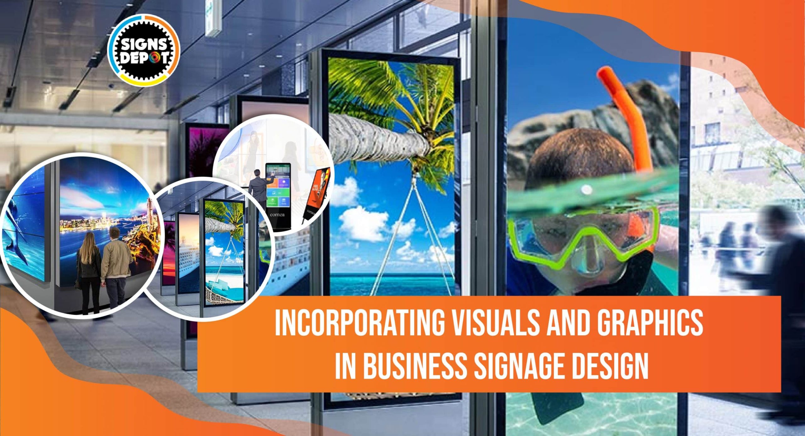
You have been inspired by your contenders and spent a hefty amount on signage design. But your signs are neither getting noticed by pedestrians not able to hold their interests. If you are facing a similar situation, it’s time to think beyond the simple text and revamp your signage strategy.
In today’s fiercely competitive era, businesses must adopt every possible way to grab audiences’ attention. By incorporating visuals and graphics into your signage design, you can not only make your signs more compelling but also improve customer engagement and retention for your business.
According to statistics, 50% of new customers are inspired by business signs and make their purchase decisions. If you want to make a strong impact on your local audience, consult with the best sign shop in Toronto that will help you create compelling signs with intriguing graphics and words.
This blog also shows how visual elements in business signage will enhance your brand visibility, awareness, and, ultimately, sales in Toronto’s hyperactive market.
The unending power of visual communication
Visual communication is a robust marketing tool that diminishes language barriers and conveys messages quickly and effectively in front of audiences. People tend to remember 80% of what they see; and this is the power of visual communications.
To make your signage strategy successful, you should utilize visual components in your business signs. Visual business signs are imperative to establish a strong presence in Toronto’s market. Let’s explore this.
Capturing Attention
As a metropolis, Toronto’s markets are highly competitive and crowded. Every day, new businesses enter and replace existing ones.
To make them sustainable in this steep, competitive market, businesses in Toronto are adopting multifarious ways to capture the attention of potential customers. An impeccably designed sign with eye-catching visuals can help cut through the noise and create a long impression on customers.
By incorporating intrepid graphics, striking imagery, or vivacious colors, companies can create enthralling visuals to stop pedestrians in their tracks and draw them in.
Recommended reading: The Art of Effective Business Signage: Tips from Industry Experts
Instant Communication:
Humans are greatly inspired by visuals. Our brain processes visual information faster than normal texts. According to a study, visuals are processed 60000X faster than normal texts.
Visuals are ideal communication tools when you want to convey information and messages quickly to your targeted audiences. If you create business signs with compelling visuals, they can communicate your brand message in an instant, quickly catching the attention of locals and passersby and leaving an enduring impression.
Strengthening brand identity
If you want to overshadow your competitors in Toronto’s competitive business landscape, you must position your brand strongly in the market. A strong brand identity will inspire your impending visitors to choose you over others and become loyal customers.
Visual components such as colors, logos, and typography contribute a significant role in shaping your brand identity. Visual signs fortify brand identity and create a unified visual experience across various touchpoints.
Branding consistency across all mediums improves brand recognition and reinforces trust and loyalty among customers.
Enhanced Engagement
Striking visuals and graphics can easily captivate audiences and motivate them to connect with the brand.
While creating custom business signs in Toronto, you must strategically use animated colors, quirky images, or out-of-the-box design elements to pique curiosity and encourage audience interaction. These days, digital signs are ruling everywhere as they offer the highest engagement and interaction. According to a study, 60% of customers make purchases from a brand that incorporates digital signage campaign strategies.
Companies are making digital signs more intriguing with QR codes or augmented reality, enhancing customer engagement and creating unforgettable experiences for viewers.
Wayfinding and Navigation:
Toronto enjoys the status of a metropolis as it is jam-packed with airports, malls, and large campuses. In such a convoluted cityscape, visual signs play an imperative role in guiding people to their destinations.
Clear and spontaneous visual signage solutions help dwellers navigate intricate spaces comfortably, minimizing confusion and vexation. Every business should incorporate effective wayfinding principles and useful visual landmarks into its signage approaches to facilitate smooth navigation and improve overall customer experience.
Emotional Connection
You must focus on customer retention strategies to enhance your sales and profit in a city like Toronto. Customers can stay loyal to you only if they connect with your brand emotionally.
Here, in addition to conveying information, visual signage solutions that evoke emotions are entered. Visual signs can create emotional connections that resonate with demographics on a deeper level, whether through exciting imagery, funny graphics, or nostalgic components.
A renowned sign shop will help you tap those emotions into signage design, leaving an enduring impression and fortifying meaningful connections between brands and customers.
Adaptability and Versatility:
With the intrusion of digital signage, the potential for visual creativity is limitless.
Digital displays are dynamic, versatile, and flexible. They allow companies to experiment with relevant content, visuals and animations to make their signs more intriguing and customer-centric.
From conventional static designs to dynamic video walls, signs can adapt to different environments and contexts, ensuring optimum impact, awareness, visibility and relevance.
Tips for creating effective visual signs for your business in Toronto
Go for simplicity
Don’t over-burden your visual signs with too much information or intricate graphics. You should focus on conveying your brand message clearly and concisely with intriguing visuals.
Use High-Quality Images
Blurry or pixelated images not only diminish the overall impact of your visual signs but also tarnish your brand value. Always invest in high-quality images that are crisp, clear, and visible from afar. Ensure they are correctly sized and formatted for printing for optimum benefits.
Choose Colors Wisely
Colors can instill emotions and influence the purchase decisions of your potential customers. Choose colors that are aligned with your brand persona and evoke the desired response from your targeted demographics.
Consider Scale and Placement
To make your visual signs effective, don’t overlook the size and placement of visual components. Ensure visuals are large in size so that people can notice them from afar. Install these visuals strategically so that they give the maximum visibility and coverage.
Balance Text and Visuals
Though your prime focus is on visuals, you need to maintain a balance between images and text. Make sure all texts are clear and readable.
Test and Iterate
You may not be able to achieve the desired results with a single visual. So, try experimenting with different designs and visual elements to see what works well with your customers. Test your signage in various locations and collect feedback from your customers to improve your designs and concepts.
Recommended reading: Exploring Signage Trends in 2024: Insights and Predictions
Real-World Examples
Let’s understand the importance of visuals and graphics for companies that have already incorporated these into their signage design.
Apple: This omnipresent brand has made its signs with minimal aesthetic features like clean lines, simple graphics, and bold typography that portray the brand’s persona and ethos.
Nike: This sports-renowned brand creates dynamic visuals of athletes in action, with a sense of energy and movement that complements the brand’s identity.
Conclusion
Signs, which include alluring visuals and graphics in business, are paramount for gaining attention, strengthening brand identity, and creating a positive brand image for customers.
By following the above-mentioned information with real-life examples, businesses in Toronto can create fascinating signage that not only stands out in a hyperactive marketplace but also improves customer retention and engagement.
In today’s visually driven world, words are not sufficient to achieve the best results for your thriving business. To create an impact, every company should infuse visual communication with texts for its marketing communications.
Signs Depot is a renowned signage company in Toronto that has plenty of ideas regarding how to create visual signs that incorporate graphics and words. After analyzing your business needs and objectives, our signage experts will design the best signs (rich in visuals and words).
For any type of signage requirement, just email us, and we will provide the best solution.
FAQs
What types of visuals can I use in my business signage design?
You are free to choose any type of visuals, including photographs, illustrations, icons, logos, and infographics. Go for visuals aligned with your brand’s core value and message. Only the right visuals help you to capture the attention of your targeted audience.
How can I get started with incorporating visuals and graphics into my business signage design?
First, you must identify key messages you want to convey with your business signs. Then, brainstorm visual ideas with those messages and appeal to your targeted audience. Finally, consult with a reputed sign shop like Signs Depot to create visually enthralling signage that successfully communicates your brand identity and message.


